
JMeter Test results
JMeter uses so called listeners to record the results of test runs. JMeter is able to display the results as tables or graphs and - even better for later analysis - to write them to a log file.
That’s what we do here. We let JMeter write the results to a file. The results of the test run consist of many samples. Each sample describes which test step ran, when did it start, how long did it take and what the response of the test case was.
JMeter can be configured to save the results in different formats. I chose XML format but it could be CSV format too.
The XML format looks similar to this:
<?xml version="1.0" encoding="UTF-8"?>
<testResults version="1.2">
<httpSample t="1392" lt="351" ts="1144371014619" s="true"
     lb="Log on" rc="200" rm="OK"
     tn="Listen 1-1" dt="text" de="iso-8859-1" by="12407"/>
This appears to be quite cryptic but it isn’t. The attributes are just shortened and have the following meaning
| by: | Bytes |
| de: | Data encoding |
| dt: | Data type |
| lb: | Label |
| lt: | Latency = time to initial response (milliseconds) - not all samplers support this |
| rc: | Response Code (e.g. 200) |
| rm: | Response Message (e.g. OK) |
| s: | Success flag (true/false) |
| t: | Elapsed time (milliseconds) |
| tn: | Thread Name |
| ts: | timeStamp (milliseconds since midnight Jan 1, 1970 UTC) |
Test results as graphs
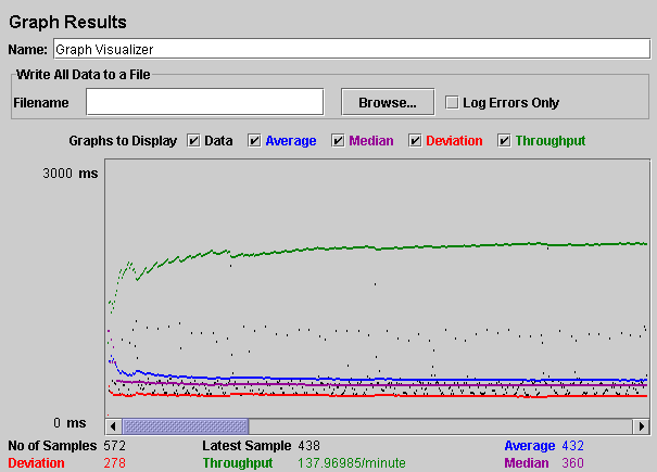
Analyzing the log file manually ain’t the most efficient way to get some insight how your application performs if you have a lot of samples. Graphs are much better at visualizing data. Unfortunately, the capabilities of JMeter to produce graphs are very limited and didn’t help at all for my long running load tests: The lines of the graph were overwriting itself for a long running test and there are almost no possibilities to adjust the graph to your needs.
See below an example of a JMeter graph from the JMeter manual:
Using a graphing utility for diagrams
GnuPlot is a command-line driven graphing tool which I already used several times for this purpose and it is very flexible and powerful . Some people might want to use Excel for creating the graphs but it had in my case too many limitations. GnuPlot has the advantage of being open source, is available on many operating systems and can be automated to generate graphics.
Preparing the data for graphing
GnuPlot needs the data in format that it can understand. That means I need to extract the data from the log file and convert it in a format that GnuPlot can read.
There are several ways to do this. I decided to write a Ruby script for data extraction. Ruby is with its built-in regular expression capabilities a very good fit for text file parsing. and I wrote a small script which extracts the values I need and writes them to another file which can be read by GnuPlot.
Performance testing implies that we are measuring time. Time it takes until we get a response from our server in this case. The JMeter log files contains two different values for the response time: Elapsed Time and Latency
From the JMeter glossary :
Elapsed time
JMeter measures the elapsed time from just before sending the request to just after the last response has been received. JMeter does not include the time needed to render the response, nor does JMeter process any client code, for example Javascript.
Latency
JMeter measures the latency from just before sending the request to just after the first response has been received. Thus the time includes all the processing needed to assemble the request as well as assembling the first part of the response, which in general will be longer than one byte. Protocol analysers (such as Wireshark) measure the time when bytes are actually sent/received over the interface. The JMeter time should be closer to that which is experienced by a browser or other application client.
What I am basically interested in for each sample is:
- How long did the response take for one of the test steps?
- Was is successfull?
- I want to have the results grouped by test steps as the test steps differ quite a lot regarding backend processing. E.g. a simple calculation is usually much faster than a data retrieval from a database.
This means my script should do the following:
- Go through the file and check each line if it contains the label for test step
- If it finds the label for the test step and if it was successful then extract the elapsed time and the time stamp
- Convert the timestamp to another time format if required by GnuPlot
- Write the elapsed time and time to a new file readable by GnuPlot
- Start GnuPlot with some parameters and let it generate the diagram for me
Errors will be handled differently. They will go to another file for further analysis.
What did we accomplish so far:
- We had a look at the JMeter log file format.
- We decided what data we want to show in the diagram
- We decided what kind of data we need to extract from the log file
- We chose a tool for graphing
- We defined what our extraction script should do to prepare the data for graphing
What is still missing:
- The extraction script has to be written and tested
- The diagram
The script code and some example diagrams will follow in one of my next blog articles.